Creative Director • Director Photography
Design, Web, Video, Merchandise
The Ask
Build the brand identity for Chow Lucky Noodle Bar, a quick-service Asian outlet concept, offering traditional dishes in a fast, convenient format. Unlike the sit-down hospitality brands elsewhere in the Gateway portfolio, this was a QSR problem: the brand needed to work at speed, both in guest experience and in visual communication.
The Challenge
Quick-service Asian concepts run a real risk of leaning on tired, generic "Asian restaurant" visual shorthand — the challenge was building an identity that felt authentic and specific rather than stereotypical, while still communicating "fast, convenient, flavourful" at a glance. That meant finding a way to honor cultural symbolism (luck, longevity) without reducing it to cliché, and pairing it with a palette and system simple enough to work cleanly across small-format QSR touchpoints — menus, packaging, in-store signage — where there's little room for visual complexity. The name itself, playful and direct, set the tone; the identity had to match: approachable and fun, not fussy or overly formal.
The Solution
The response built a focused, high-impact identity system rather than a sprawling one:
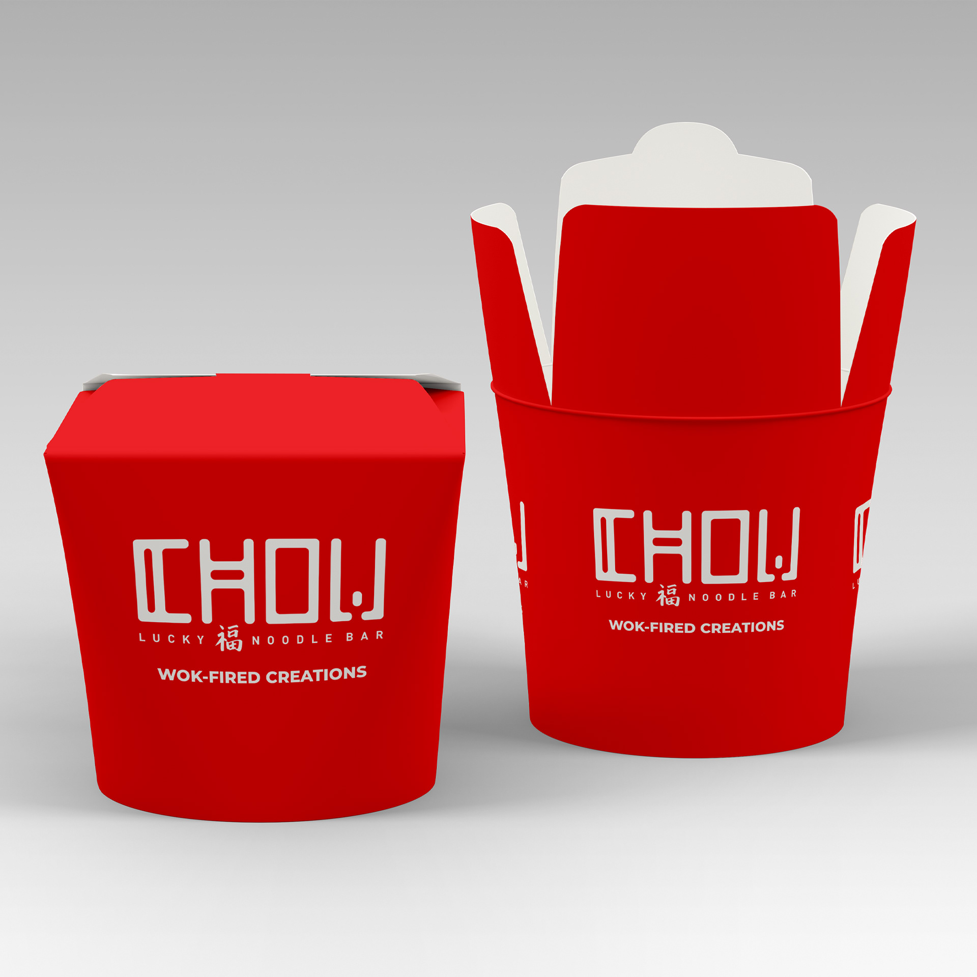
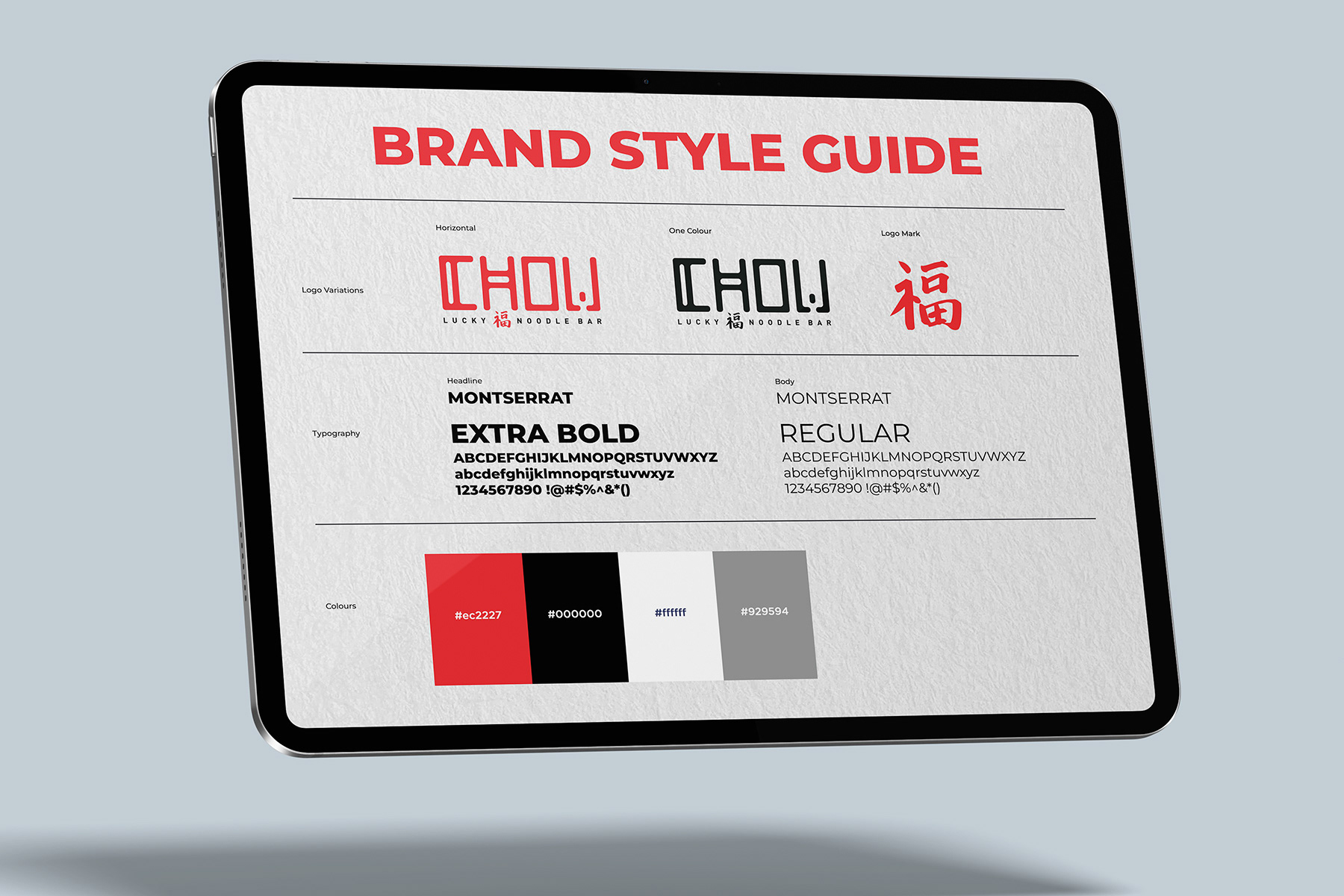
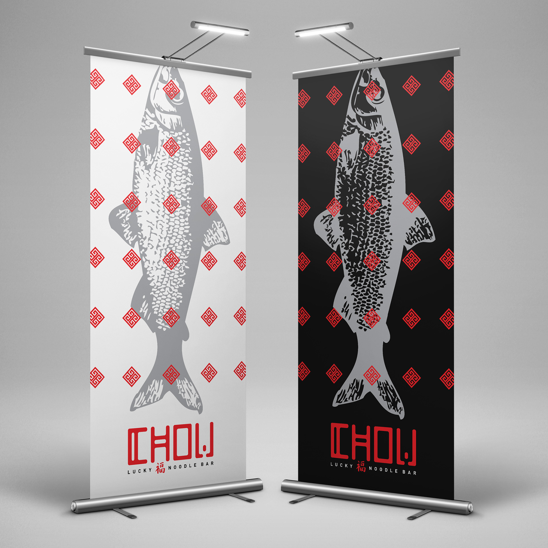
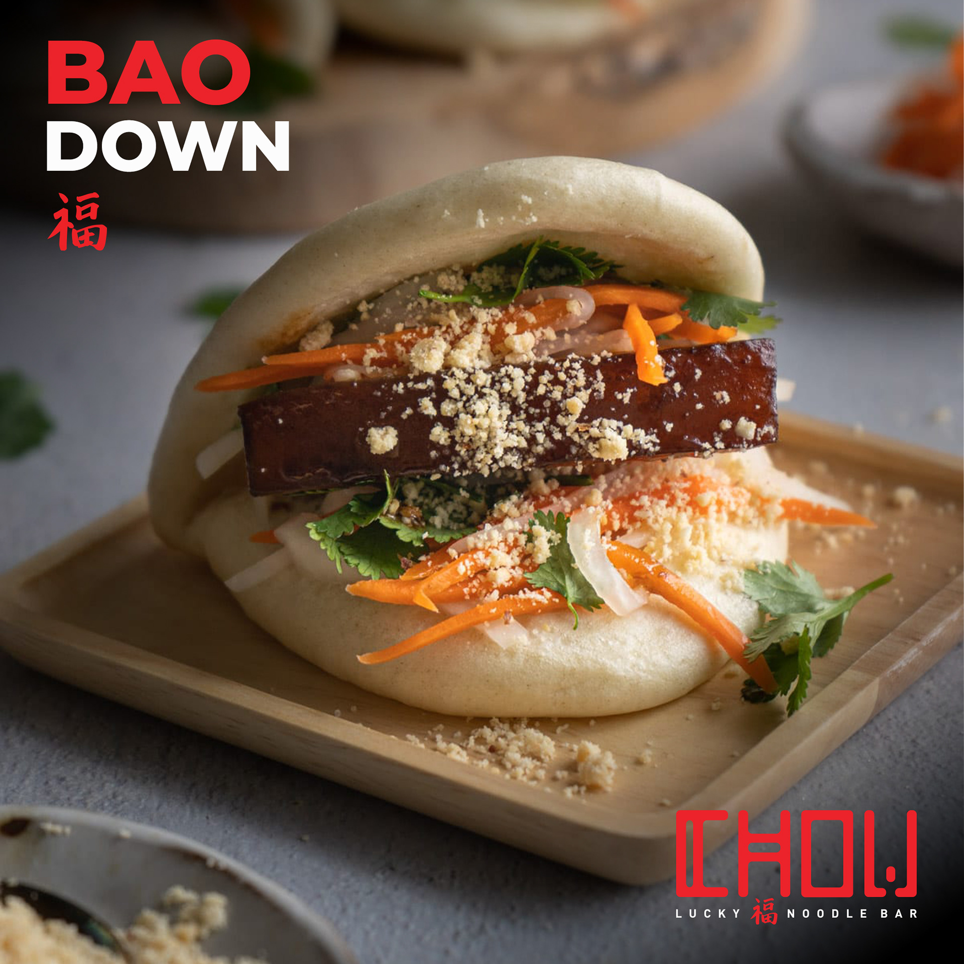
Symbolic logotype • a bold, red stylized font blending modern typography with a classic Eastern aesthetic, directly symbolizing luck and long life rather than relying on generic cultural imagery.
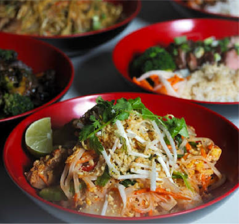
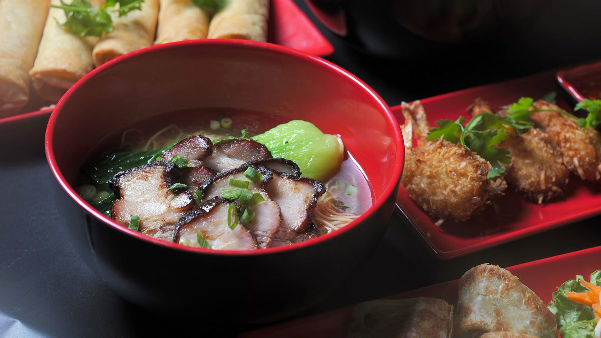
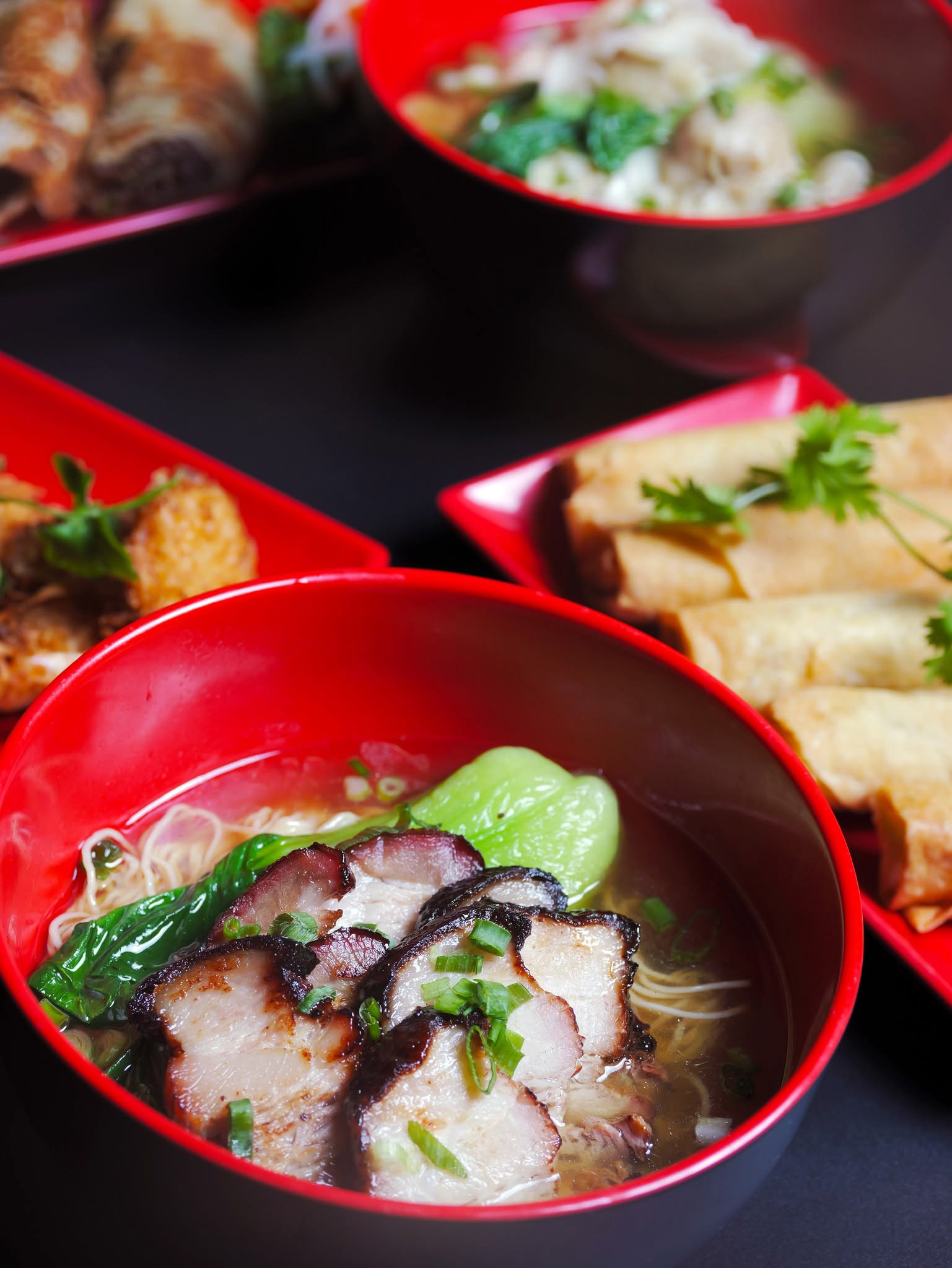
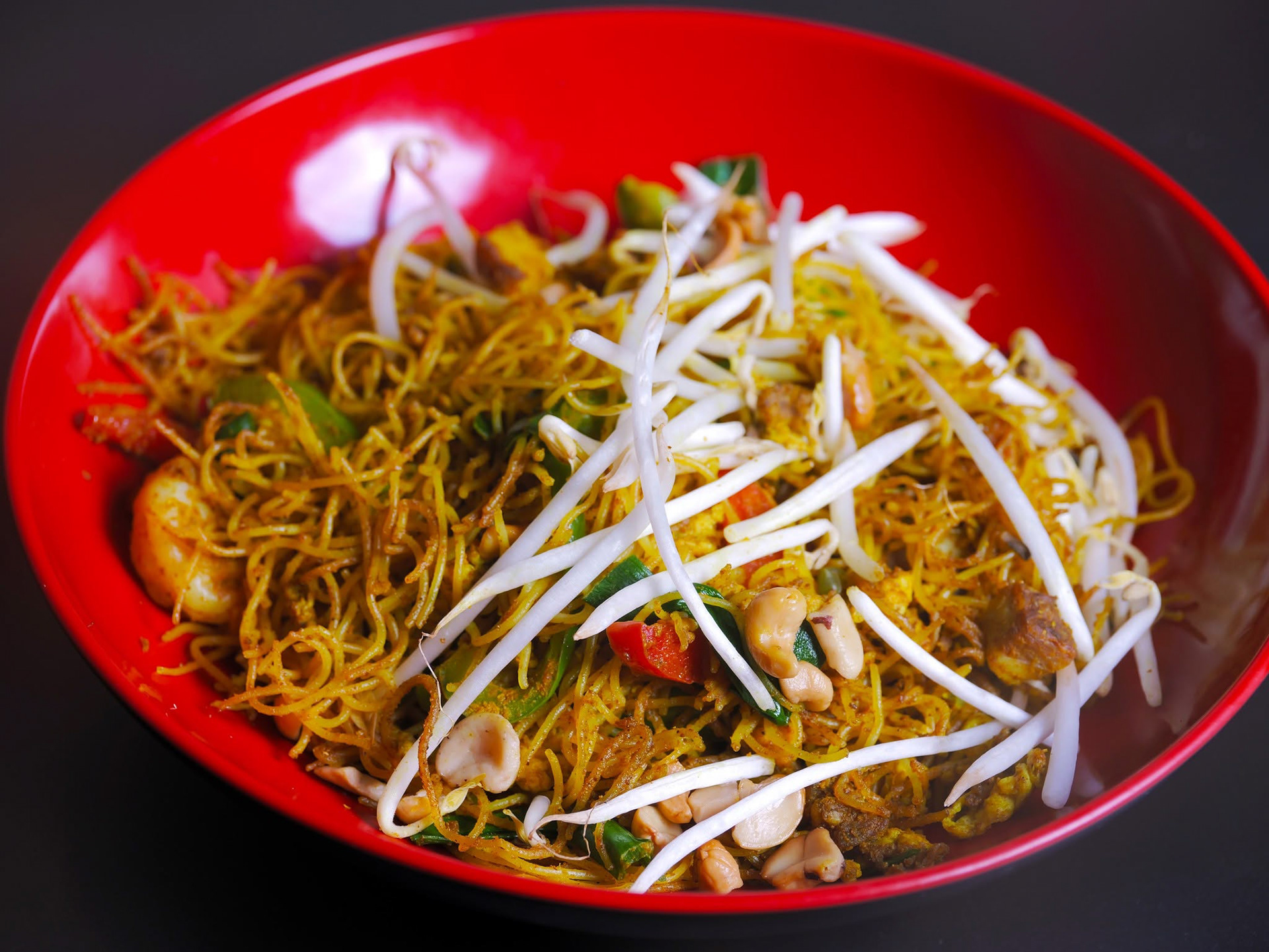
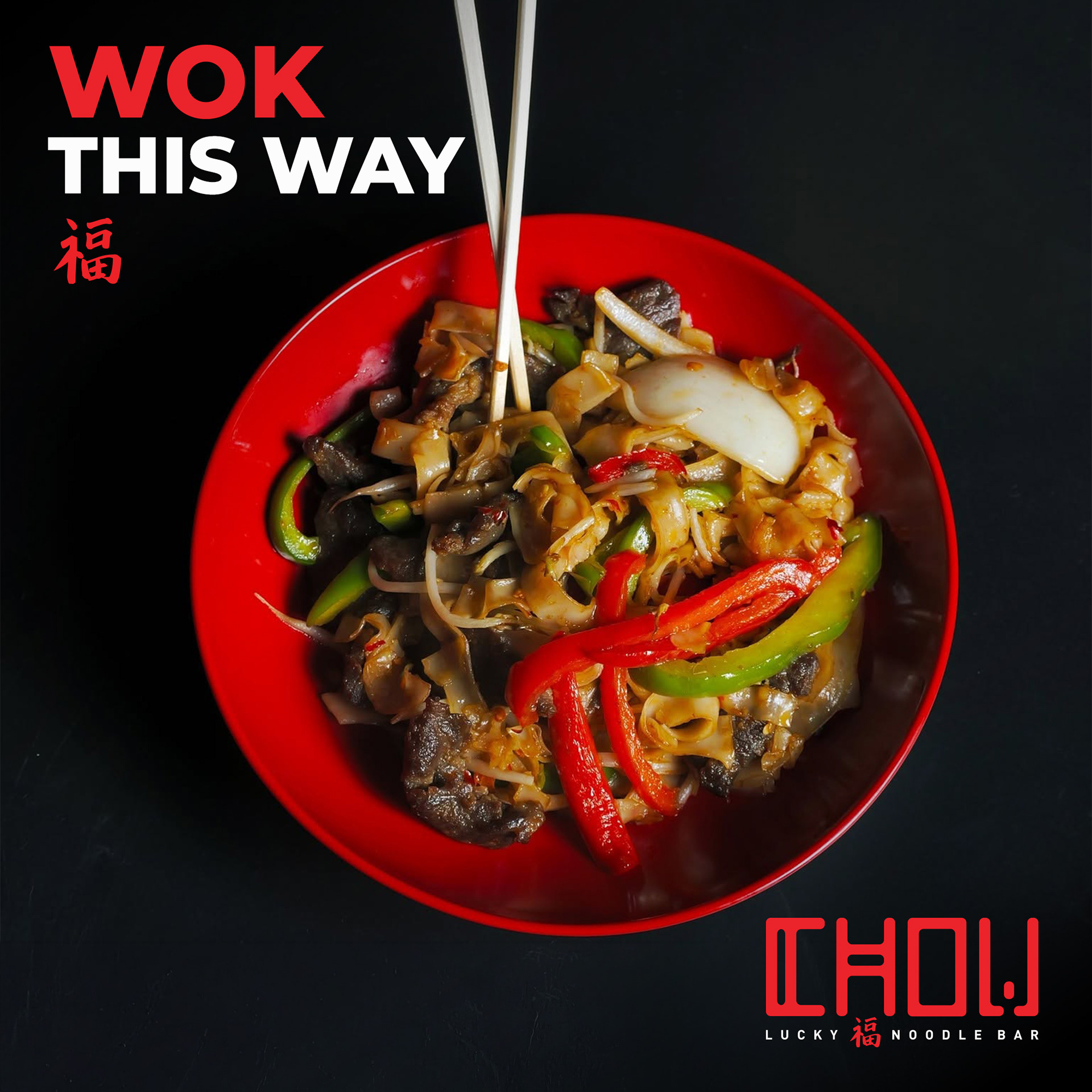
Purposeful color strategy • a simple, high-contrast palette chosen as a deliberate callback to the simple yet flavourful cuisine coming out of the open wok-fired kitchens, tying the visual system directly back to the product itself.
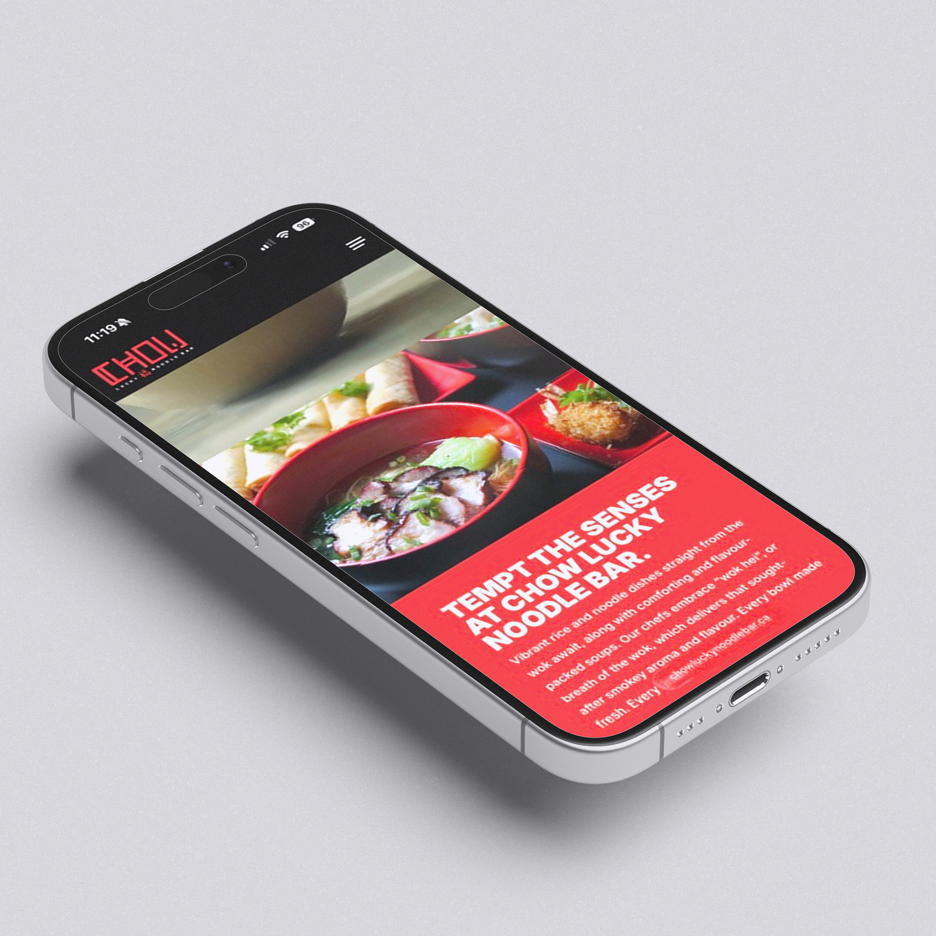
Full brand buildout • brand development and a website build gave the concept a consistent foundation across guest touchpoints.
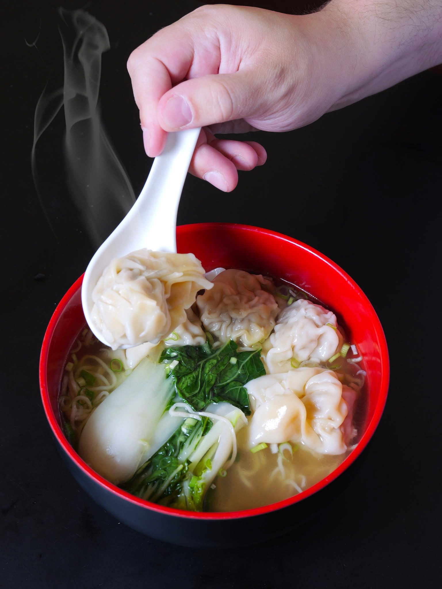
Guest-facing execution • branded merchandise, photography, and in-house printed POS brought the identity into the physical ordering experience.
Awareness • social campaigns and digital channels extended the brand beyond the outlet itself.